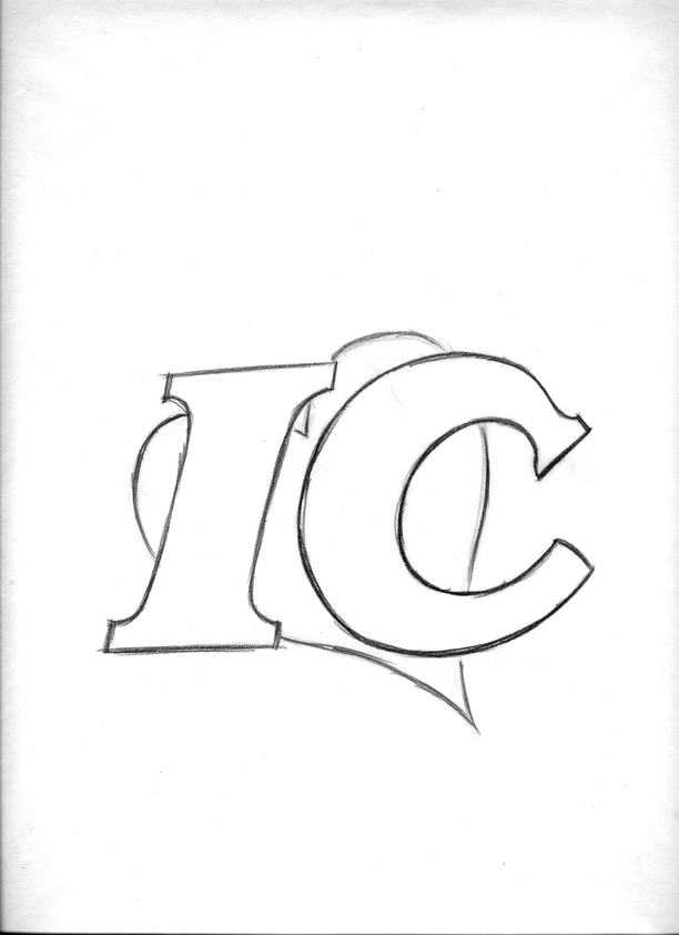
After all of that, the company decided that just the letters and the heart were wanted. We also talked about the type design. A move toward a bolder font with more stubby serifs was what I understood the company now wanted. I took stock of the type examples the company was fond of and put a slight dynamic slant to the "IC." The latest bunch of designs follows...


...and the lowercase options...


No comments:
Post a Comment