
Showing posts with label Design. Show all posts
Showing posts with label Design. Show all posts
Sunday, March 25, 2012
The Celestial Hurl
A friend of mine asked me to do a really quick (one day) turnaround for an illustration advertising a reading of one of her new scripts. I normally don't do this, but the title of the script gave me a fun idea. I looked to ancient star/constellation charts for inspiration. The drawing I did for the illustration was really rough, so I took it into photoshop for a bit of speedy finishing. The text was done in Illustrator and then I treated it to the same filter I used on the rest of the piece.

Saturday, January 14, 2012
The Fall of Inkazimulo 6
I feel that this page is one of the best I've ever done.

The Fall of Inkazimulo is a 2010 Copyright of Aaron Watts
Sunday, January 8, 2012

Thursday, January 5, 2012
IC Logo 18

The last run of logos with the white outline inevitably led to a simple color heart, with solid white letters inside it. The heart is a darker color to increase the contrast with the white letters. The letters and the heart also have a slightly darker, thin outline to aid the contrast.
And the black/white conversion...

IC logo 17


I have a small group of fellow artists that I trust and ask to critique my work. After seeing my efforts on this project, one of them suggested I use a white outline on the letters within the heart. So, I tried it out.
Tuesday, January 3, 2012

Tuesday, December 27, 2011

Thursday, December 22, 2011
The Fall of Inkazimulo 2
This is page two.
A buddy of mine entered the Zuda contest a couple of years before me, and has since decided to redo the entire look and pacing of his idea. Taking a cue from my friend, I've decided to lengthen the pacing of this story. This will also help to address a critique that I agree with from some who commented on my story while it was in the contest. That critique was that the comic was too wordy. I intend keep the same amount of descriptive narration and dialogue, only spread over many more pages.

The Fall of Inkazimulo is a 2010 Copyright of Aaron Watts
Tuesday, November 15, 2011
IC Logo 16
So, the company decided to go with a the big heart behind the capital letters. After some Illustrator love, I sent over three black and white options and three color options.


Friday, November 11, 2011
IC Logo 15
After all of that, the company decided that just the letters and the heart were wanted. We also talked about the type design. A move toward a bolder font with more stubby serifs was what I understood the company now wanted. I took stock of the type examples the company was fond of and put a slight dynamic slant to the "IC." The latest bunch of designs follows...

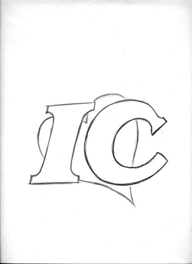


...and the lowercase options...


IC Logo 12
So the company really liked the heart and wanted me to explore that more.


At this point, I took away the abstracted snake and added the pulse lines from an electrocardiogram to underscore the medical aspect of the company.


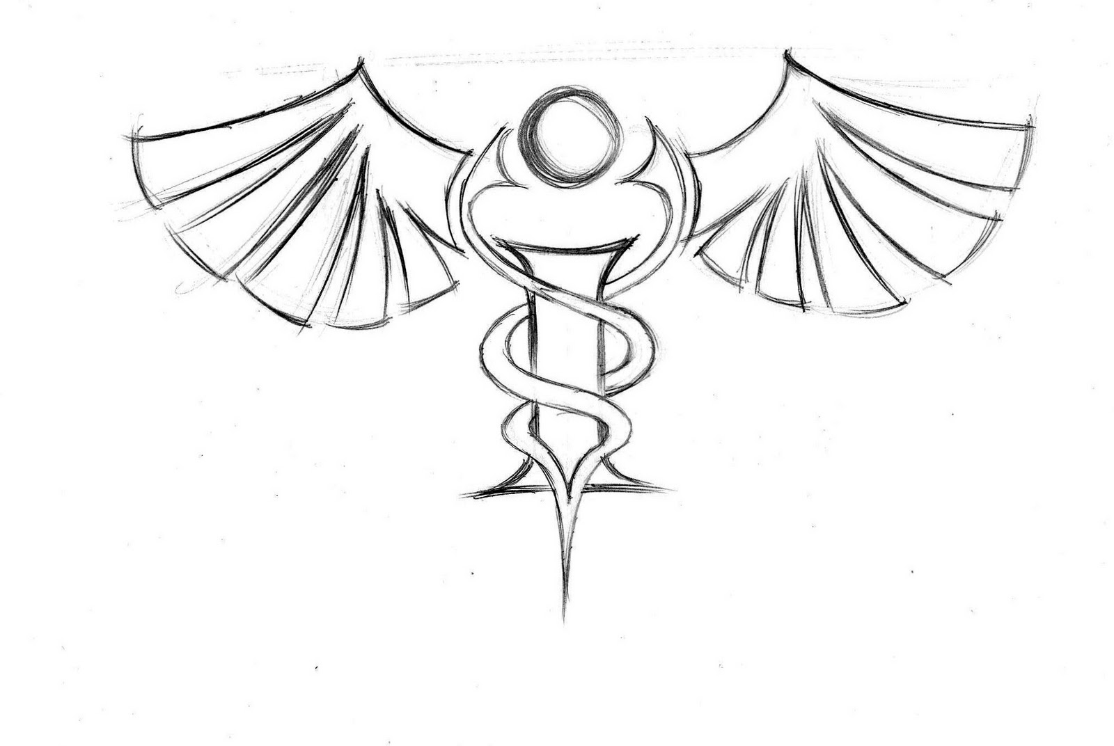
IC Logo 9

In my research for this project, I came across a lot of cool abstractions for the Rod of Asclepius. I decided to try my own.
Subscribe to:
Comments (Atom)