Tuesday, December 27, 2011

The Fall of Inkazimulo 3

Page 3


The Fall of Inkazimulo is a 2010 Copyright of Aaron Watts

Thursday, December 22, 2011

The Fall of Inkazimulo 2

This is page two.
A buddy of mine entered the Zuda contest a couple of years before me, and has since decided to redo the entire look and pacing of his idea. Taking a cue from my friend, I've decided to lengthen the pacing of this story. This will also help to address a critique that I agree with from some who commented on my story while it was in the contest. That critique was that the comic was too wordy. I intend keep the same amount of descriptive narration and dialogue, only spread over many more pages.


The Fall of Inkazimulo is a 2010 Copyright of Aaron Watts


Sunday, December 18, 2011

Wednesday, December 14, 2011

Monday, December 12, 2011

Friday, December 9, 2011

Wednesday, December 7, 2011

Monday, December 5, 2011

When Chickens Talk 1

Here's the first part of a sample storyboard. The story is a fiction of my own.


Wednesday, November 30, 2011

The Fall of Inkazimulo 1

Back in March of 2010, I entered an online contest for comic book creators at Zudacomics.com. It was  DC Comics' short-lived, online farm for new talent.
Each contestant entered an eight page, original story. The editors at Zudacomics picked ten entries to be voted on at the beginning of a month. Visitors to the site voted on their favorites. At the end of the month, the entry with the most votes won, and the creator got a year long, paid contract to make one page per week to add to their eight page entry.
A good deal for a lot of exposure.
I came in third. Here's the first page of my entry.


The Fall of Inkazimulo is a 2010 Copyright of Aaron Watts

Sunday, November 27, 2011

The Birth of Venus in Lederhosen 3

Being a chalk drawing, the piece got smudged. I went back to touch it up and add more detail. I did that and also drew two new panels.


Venus got some new lederhosen.


As did the two goat men.


Detail of the new left side.


Detail of the new right side.


And the best shot I could get of the whole thing.

Friday, November 25, 2011

The Birth of Venus in Lederhosen 2

Here are some details of the piece.


Venus


With a halo of sausages


Right panel


Left panel

The Birth of Venus in Lederhosen

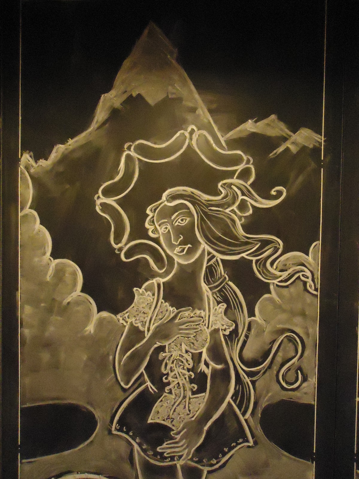
Earlier this year, I got the opportunity to do a huge chalk drawing on a huge chalkboard, paneled wall. The only parameter was that the drawing had to have a German bier garten theme.
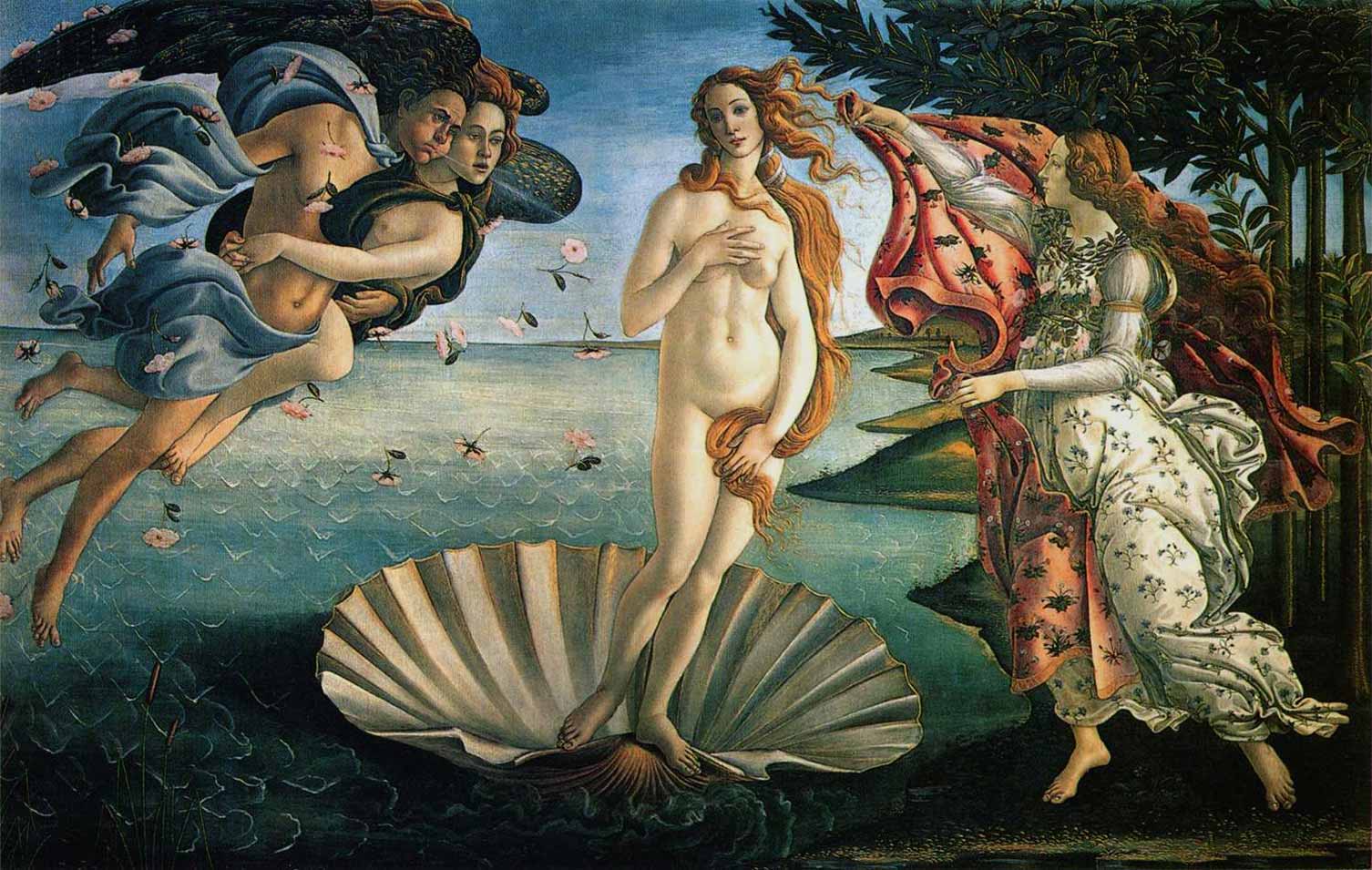
The visual theme of the rest of the place was whimsically sexual, so after some thinking, I decided to do a loose homage to Botticelli's "The Birth of Venus."


I named it, "The Birth of Venus in Lederhosen."


This is after my first 5 hours working on the wall. I placed the scene in a mountain valley because mountains seem more German to me than the ocean does. Accordingly, a mountain stream replaces the ocean, and goat-men replace the Zephyrs on Venus' right and the one Hour on her left. The cherubs pouring beer down from giant steins to create the mountain stream just seemed like a fun idea.


Here is the wall with a flash to better show the upper corners of the piece.

Friday, November 18, 2011

The Tree of Ra 6


This is the final attempt. I took away the bars because the client didn't like them. I enlarged the branches at the top of the tree and changed the large branches on either side of the Eye into smaller branches to make the spacing there more ambiguous and less awkward. Without the bars, the roots are simpler and provide a nice calm balance to all of the activity at the top of the tree. The client liked this version best of all, but when she saw it in person she felt it was too big, ha! It would have covered half of both shoulder blades and reached down to the bottom of her lower back.
We are in talks about another, smaller solution.

The Tree of Ra 5


The client liked the first attempt pretty well. I made another attempt though, because I wanted to add the cross bars from the hieroglyph to link the image even more strongly to Egyptian art/writing.


Even though I liked the way I resolved the spacing between the leaves and the Eye of Ra here better than in the first attempt, I felt that the roots of the tree could use more work. Also, the client liked this version less than the first one. So it was back to the drawing board.

Wednesday, November 16, 2011

The Tree of Ra 4

I proposed that since Ra is the Egyptian sun god, I would simply place her tattoo of the Eye of Ra into the spot of the Tree of Life at the top center, where the sun is. A nice conceptual fit. The client liked the idea and I went ahead with my first attempt...

The Tree of Ra 3

Here's the main sketch I did of the Egyptian Tree of Life in order to sort out the design elements that I thought would make the greatest impact.

The Tree of Ra 2

After doing an image search for the tree of life, I determined that my client's original tattoo was so detailed and involved that I couldn't see how I could transform it into a tree of life without making a big, nasty eyesore of a blob toward the top of the tree.
The tree of life is an ancient idea though, so maybe the Egyptians had their version of it too. And maybe, just maybe, it's been illustrated, photographed and put online. I did a search and lo and behold!

The Tree of Ra 1

Another client asked me to make something new out of an old tattoo on her back, between her shoulder blades. The old tattoo is a hieroglyph of the Eye of Ra found in the grave of some old, dead Egyptian. I made a tracing and got to thinking...


The client wanted to have the new design cover up the old tattoo somehow, so that the Eye of Ra was transformed into something new and different, namely, a design of the Tree of Life.

Tuesday, November 15, 2011

IC Logo 16

So, the company decided to go with a the big heart behind the capital letters. After some Illustrator love, I sent over three black and white options and three color options.


Friday, November 11, 2011

IC Logo 15

After all of that, the company decided that just the letters and the heart were wanted. We also talked about the type design. A move toward a bolder font with more stubby serifs was what I understood the company now wanted. I took stock of the type examples the company was fond of and put a slight dynamic slant to the "IC." The latest bunch of designs follows...


...and the lowercase options...