Friday, November 18, 2011

The Tree of Ra 5


The client liked the first attempt pretty well. I made another attempt though, because I wanted to add the cross bars from the hieroglyph to link the image even more strongly to Egyptian art/writing.


Even though I liked the way I resolved the spacing between the leaves and the Eye of Ra here better than in the first attempt, I felt that the roots of the tree could use more work. Also, the client liked this version less than the first one. So it was back to the drawing board.

Wednesday, November 16, 2011

The Tree of Ra 4

I proposed that since Ra is the Egyptian sun god, I would simply place her tattoo of the Eye of Ra into the spot of the Tree of Life at the top center, where the sun is. A nice conceptual fit. The client liked the idea and I went ahead with my first attempt...

The Tree of Ra 3

Here's the main sketch I did of the Egyptian Tree of Life in order to sort out the design elements that I thought would make the greatest impact.

The Tree of Ra 2

After doing an image search for the tree of life, I determined that my client's original tattoo was so detailed and involved that I couldn't see how I could transform it into a tree of life without making a big, nasty eyesore of a blob toward the top of the tree.
The tree of life is an ancient idea though, so maybe the Egyptians had their version of it too. And maybe, just maybe, it's been illustrated, photographed and put online. I did a search and lo and behold!

The Tree of Ra 1

Another client asked me to make something new out of an old tattoo on her back, between her shoulder blades. The old tattoo is a hieroglyph of the Eye of Ra found in the grave of some old, dead Egyptian. I made a tracing and got to thinking...


The client wanted to have the new design cover up the old tattoo somehow, so that the Eye of Ra was transformed into something new and different, namely, a design of the Tree of Life.

Tuesday, November 15, 2011

IC Logo 16

So, the company decided to go with a the big heart behind the capital letters. After some Illustrator love, I sent over three black and white options and three color options.


Friday, November 11, 2011

IC Logo 15

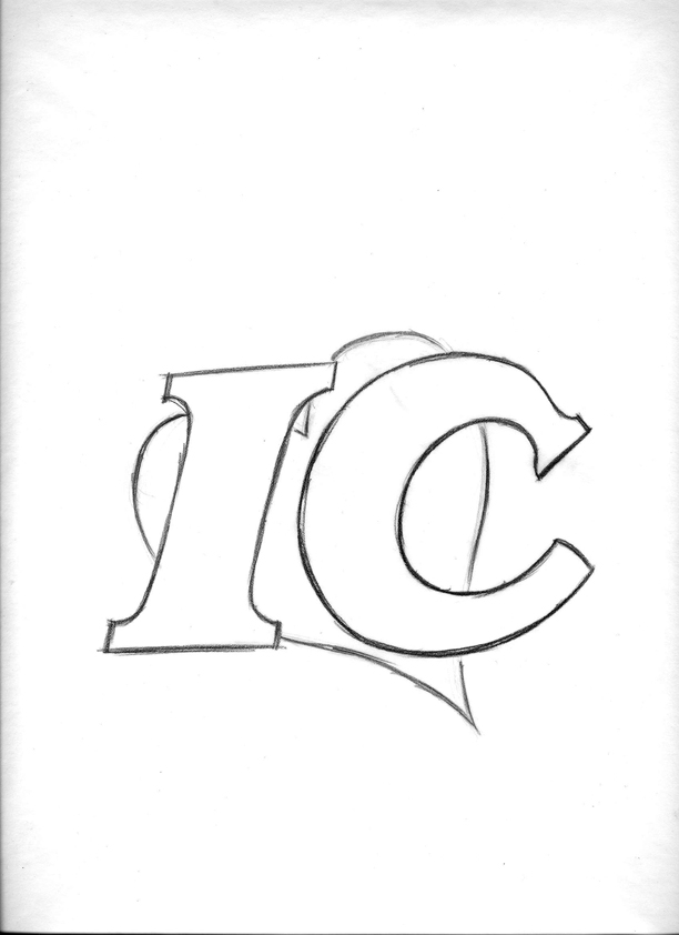
After all of that, the company decided that just the letters and the heart were wanted. We also talked about the type design. A move toward a bolder font with more stubby serifs was what I understood the company now wanted. I took stock of the type examples the company was fond of and put a slight dynamic slant to the "IC." The latest bunch of designs follows...


...and the lowercase options...