WattsWork
Friday, November 11, 2011
IC Logo 14
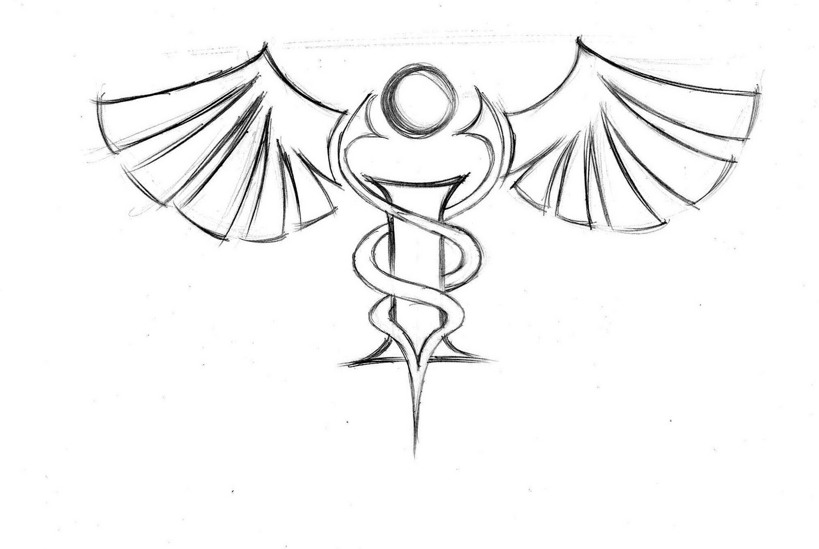
Another idea for the Rod of Asclepius.
IC Logo 13
Some other ideas...
IC Logo 12
So the company really liked the heart and wanted me to explore that more.
At this point, I took away the abstracted snake and added the pulse lines from an electrocardiogram to underscore the medical aspect of the company.
IC Logo 11
A little marker treatment while exploring size difference and two abstract snakes.
IC Logo 10
A more formal treatment with a more realistic snake.
IC Logo 9
In my research for this project, I came across a lot of cool abstractions for the Rod of Asclepius. I decided to try my own.
IC Logo 8
In this one, I replaced the circle with a heart, but I felt that it's size and placement visually confused the other elements in the image.
So, I returned to the circular background element and put the heart as the dot on the "I".
Newer Posts
Older Posts
Home
Subscribe to:
Posts (Atom)